How to Use Color in Your Garden: A Design Guide
Create a colorful garden by learning the basics of color theory & design.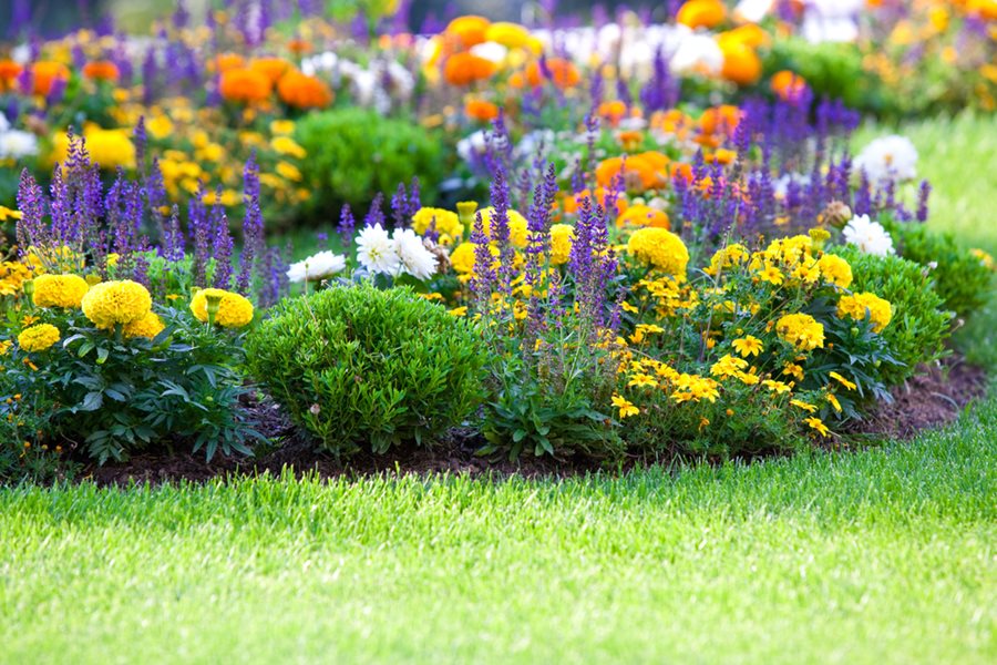
Photo by: dvoevnore / Shutterstock.
Color is usually the first thing we notice when looking at something. It is omnipresent in our daily lives and we respond to color in subconscious ways, both physically and emotionally. Color can soothe the soul, gladden the heart, or elicit feelings of excitement. “The vibration of color triggers our brains to release specific biochemicals that, in turn, affect our health and feelings,” says Jan Johnson, author of Heaven is a Garden.
Knowing how to use color in the landscape is one of the most fundamental aspects of good garden design. Color sets the mood, dictates style, and lends cohesiveness. Using color properly can mean the difference between a show-worthy garden or a chaotic mess. By understanding the basics of color theory and how to use color in the garden, you can be well on the way to creating your own beautiful outdoor space.
On this page: Color Theory | Individual Colors | Color Relationships | Color Schemes | Getting Started | Choosing Plants | Ideas & Inspiration
On this page:
- COLOR THEORY
- INDIVIDUAL COLORS
- COLOR RELATIONSHIPS
- CHOOSING A COLOR SCHEME
- GETTING STARTED
- CHOOSING PLANTS FOR COLOR
- IDEAS & INSPIRATION
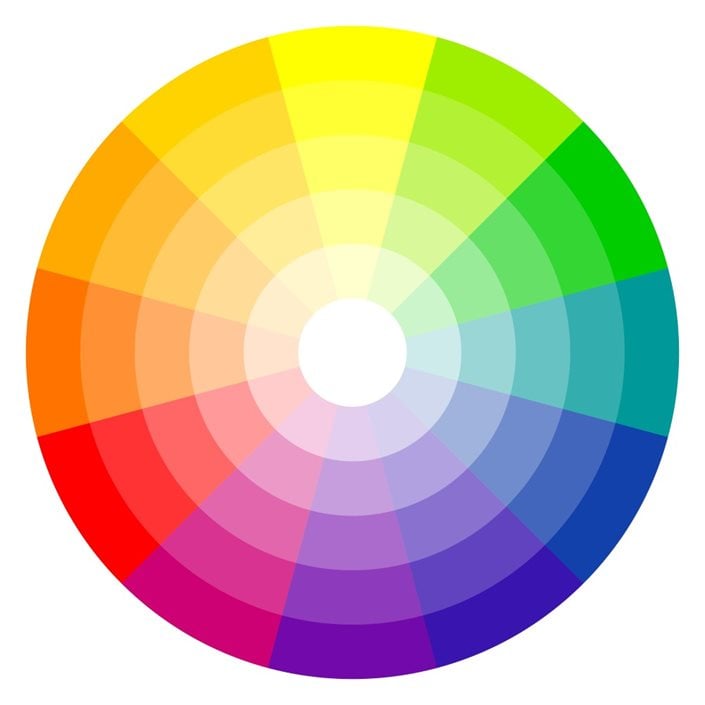
Photo by: picoStudio / Shutterstock.
COLOR THEORY BASICS
Color theory is the study of how colors work together and affect perception. It involves the color wheel, which shows the relationships between colors, and the concepts of primary, secondary, and tertiary colors. Warm colors like red and yellow bring energy, while cool colors like blue and green create a sense of calm. Neutral colors like white and gray can be used as transitions or stand-alone schemes. Value and intensity also play a role, with lighter and darker shades creating contrast.
Understanding color theory helps in creating visually appealing compositions by utilizing color relationships and variations.
There are even color wheels made specifically for gardeners.
INDIVIDUAL COLORS
Individual colors have their own symbolic meanings. Jan Johnsen gives insights to each color:
- White is the most versatile in the landscape, cools us down on hot summer days, and sparkles in the dark October evenings.
- Purple is the most requested flower color, associated with originality, uniqueness, and royalty. It's also known to calm the mind.
- Blue is restful and calm, the color of tranquility, and aids our concentration and intuition.
- Red is the color of excitement, power, and luck, and projects an air of confidence.
- Yellow helps us to feel cheerful and optimistic, enhances our mental processes and clarity of mind.
- Orange is the hottest, most flamboyant color in the spectrum, shown to excite emotions and even increase appetite.
- Green is the most restful color to our eyes, balances and alleviates anxiety, and is a neutral color in the landscape.
COLOR RELATIONSHIPS
The relationships between colors create different effects. These include:
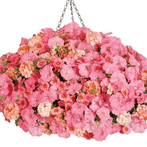
Photo by: Proven Winners.
MONOCHROMATIC
Different shades of the same color are called monochromatic colors. These combine to create a harmonious effect.
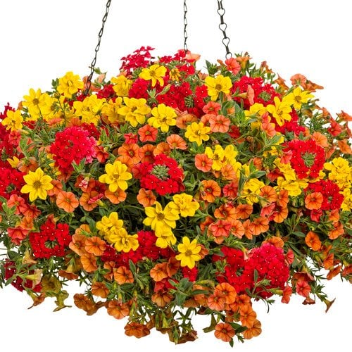
Photo by: Proven Winners.
ANALOGOUS
Colors such as reds and oranges that appear next to each other on the color wheel are called analogous colors. These have a harmonious relationship when paired together.
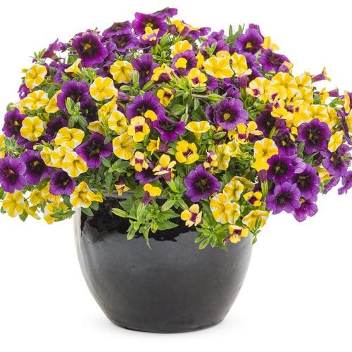
Photo by: Proven Winners.
COMPLEMENTARY
Colors opposite each other on the color wheel are considered complementary colors. These include red and green, violet and yellow, and blue and orange. When used together, these colors play off of each other to create visual tension and contrast.
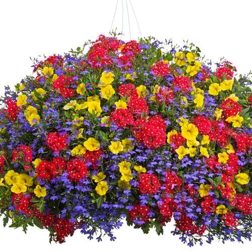
Photo by: Proven Winners.
COMPLEX
This includes two analogous colors plus a complimentary color.
CHOOSING A COLOR SCHEME
Garden color schemes are influenced by many factors including climate, culture, regional style, and personal taste. Colors are used to celebrate the seasons, such as red, green, and white for winter, pastel hues for spring, warmer colors for summer. Traditional fall hues including orange, brown, yellow, and burgundy mimic the colors of the harvest and changing leaves.
When choosing a garden color palette, consider these factors:
Set the mood: Do you want your garden to feel calming or exciting? Use subdued color combinations of blue, lavender, and white for a quiet meditation space or energizing hot colors of red, orange, and yellow for social areas where you entertain guests.
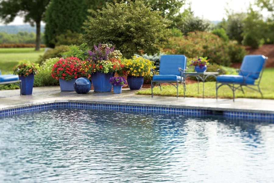
The same color blue of the pool tiles is repeated in the containers, furniture and accessories, unifying the design of this enticing poolside garden. Red and yellow flowers add pops of contrasting color. Photo by: Proven Winners.
Consider your surroundings: When choosing colors, take cues from the existing features on your property such as your house color, pathways, walls, furniture, and fencing. Is your yard surrounded by verdant woodlands, or is it a small urban lot or apartment balcony? How do you use your outdoor space? Select colors that will complement the setting.
Cold vs. hot: Cool colors are associated with the cooler season of spring and can also be used to refresh a shady oasis in the heat of summer. Hotter colors are less prone to washing out in the harsh summer sun. Use attention-grabbing colors such as red and orange judiciously, as a focal point or occasional splashes of color so as not to overwhelm the overall design.
Keep it simple: Choose no more than two or three main colors or a monochromatic color scheme. Using too many different colors can make the design feel cluttered or lacking cohesion. Other colors can be used sparingly for pops of contrast and to enhance the main colors.
Change it up: Color schemes can be varied for different parts of the yard such as garden rooms, beds, borders, containers, side yards, water gardens, and vegetable plots. To lend continuity, choose one color such as blue as the main color and vary the other colors around it from one area to another.
Create repetition: Use the same colors to pull your eye through the landscape and unify the design. Repeat those colors in garden beds, furnishings, hardscape, and structures.
Light: Observe how colors are affected by light during different seasons and times of the day. Use brighter colors such as gold, yellow, chartreuse, white, and silver to brighten up shady areas.
Include your favorite colors: Though this might seem obvious, using your favorite colors in your landscape will make you want to spend more time in your outdoor space.
Break the rules: Though the color wheel is a good starting point for using color in the garden, there are no hard and fast rules. Don’t be afraid to try new things.
GETTING STARTED
Evaluate your space: Consider the size of your yard, how you use your outdoor space, where the light falls, what kind of plants can be used in different areas, and your home’s style.
Collect ideas: Gather inspiration from books, magazines, Pinterest, and by visiting local gardens.
Make a plan: Draw up a rough sketch that includes individual garden spaces, furniture, accessories, water features, walls, fencing, structures, and plants. For bigger projects, consult a landscape design professional.
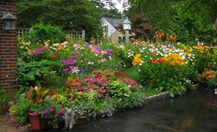
8 TIPS ON CHOOSING PLANTS FOR COLOR
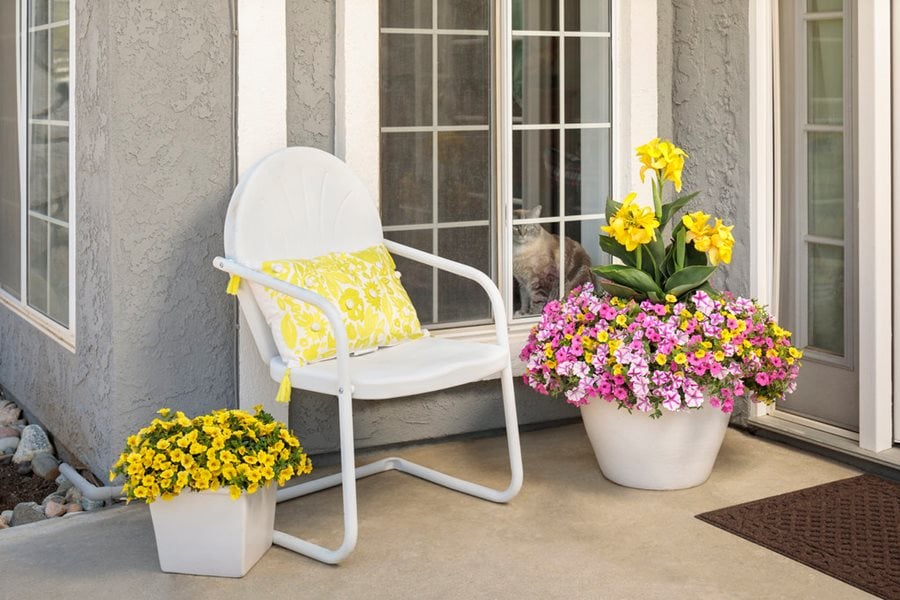
Repeat the same colors in plants, furnishings and accessories to unify the landscape. Photo by: Proven Winners.
Follow these tips when choosing plants for color:
- Select plants with multi-seasonal interest and ornamental attributes such as colored foliage, flowers, berries, and bark.
- Green foliage is a neutralizer and an effective background color to showcase other colors. There are many different shades of green including light or dark, blue-green, silver-green, or yellow-green.
- Foliage colors other than green include gold, chartreuse, burgundy, purple, red, orange, silver, gray, or variegated. Plants with variations of purple and yellow foliage are commonly used together to create contrast.
- Flowers come in nearly every color on the spectrum. Echo the same color of the flowers in foliage, containers, furniture, accessories, and structures. Pay attention to bloom time including regional differences.
- Observe how other plant attributes such as size, form and texture affect different colors.
- Include evergreen and deciduous plants with a mix of trees, shrubs, perennials, vines, bulbs, and annuals planted in layers, which will help create depth and showcase certain colors.
- Experiment with different plant combinations at the nursery before buying plants to see firsthand what colors look good together.
- Plant in drifts of the same colors and plants for greater visual impact.
COLORFUL GARDEN IDEAS & INSPIRATION
There are unlimited ways to use color in your yard. Here are some ideas to get you started:

Though green is considered a neutral color in the garden, chartreuse, which is a combination of green and yellow, creates visual excitement and contrasts well with most other colors. Here, Proven Accents® Sweet Caroline Sweetheart Lime sweet potato vine is combined with the complementary color of Summer Wave® Large Violet wishbone flower for an eye-catching color combination. Photo by: Proven Winners.
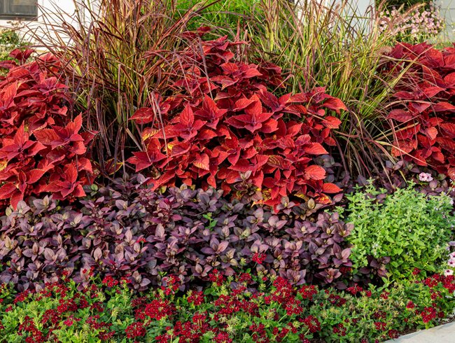
Red and purple, which are analogous colors, combine for this dynamic arrangement. Photo by: Proven Winners.

Two tones of pink, plus dark purple work together to create complementary contrast in this striking container display. Dark containers and a neutral backdrop provide a pleasing balance. Photo by: Proven Winners.

Subdued pastel shades of blue, lavender and pink combine to create a harmonious calming effect. Photo by: Proven Winners.
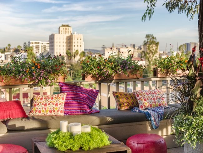
Bold colors of red, magenta, orange, and chartreuse liven up this apartment balcony for an energizing festive mood. Photo by: Proven Winners.
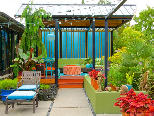
The blue background screen in this contemporary seating area adds a feeling of depth, making the space feel larger. Color echoes of orange-red and lime-green in the plants, furnishings and hardscape add contrast and draw the eye through the scene.
Designer: Laura Crockett. Homeowners: Craig Quirk and Larry Neill, Floramagoria. Photo by: Janet Loughrey.
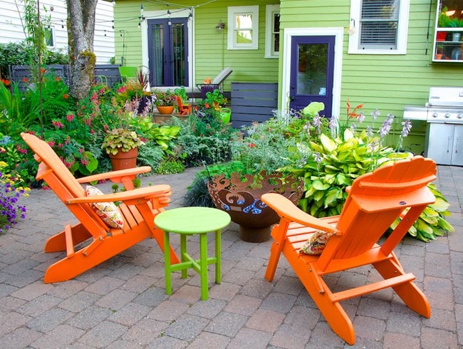
Spanish Olive paint on this home’s exterior livens up the landscape during darker winter months. The lime-green backdrop provides dramatic contrast and makes the other colors pop in this bold color scheme.
Designer: Joy Creek Nursery. Designers/Homeowners: Jeff Fisher and Ed Cunningham, The Fishingham Garden. Photo by: Janet Loughrey.
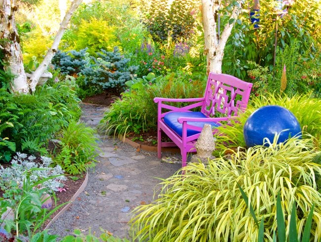
White birch trees, golden Japanese forest grass, a brightly colored bench and blue ceramic ball liven up this deeply shaded area.
Designer/Homeowner: Nancy Cutler. Photo by: Janet Loughrey.
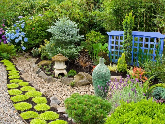
A serene Asian-style border is punctuated by a blue lattice screen, with the same color blue echoed in a nearby hydrangea bush to unify the landscape.
Designer/Homeowner: Helena Wagner, 4 Season Gardens. Photo by: Janet Loughrey.
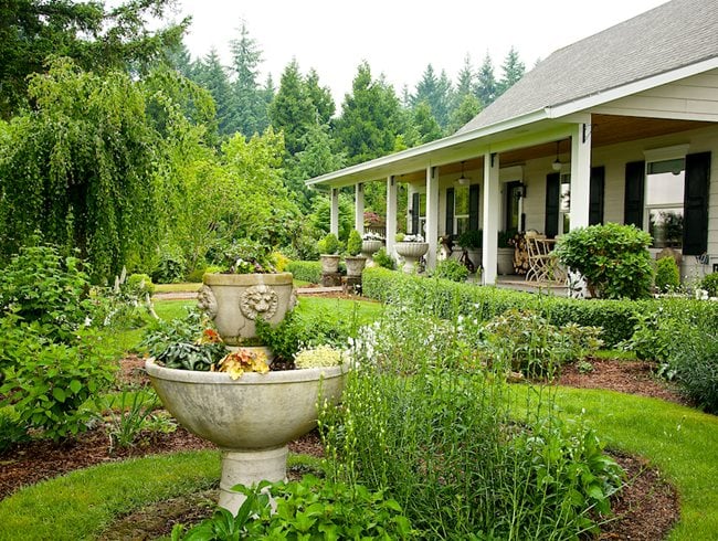
Neutral tones of white, beige and green complement the classic style of this country home and formal gardens. “White, the most versatile color in the landscape, cools us down on a hot summer day and sparkles in the dark evenings of October,” says Jan Johnsen.
Designers/Homeowners: Matthew Greydanus and Darrin Simmons, Laurel Hedge. Photo by: Janet Loughrey.

In feng shui principles, a red front door signifies good luck and is thought to invite positive energy into the home. The energizing red color is echoed in the ceramic container, while neutral hues of the bench and home’s siding tone down the brighter colors for a pleasing balance.
Designer/Homeowner: Gail Barnard. Photo by: Janet Loughrey.