Color Theory Basics
Learn the basics of color theory & design to enhance your yard.Color theory basics involve understanding how colors relate to each other and affect perception. The color wheel is a key tool, organizing colors and showing primary, secondary, and tertiary combinations. Warm colors like red and yellow are energizing, while cool colors like blue and green are calming. Neutral colors like white and gray are versatile for transitions or standalone schemes. Considering value and intensity helps create contrast and variations. Mastering color theory helps create visually pleasing compositions by leveraging color relationships.
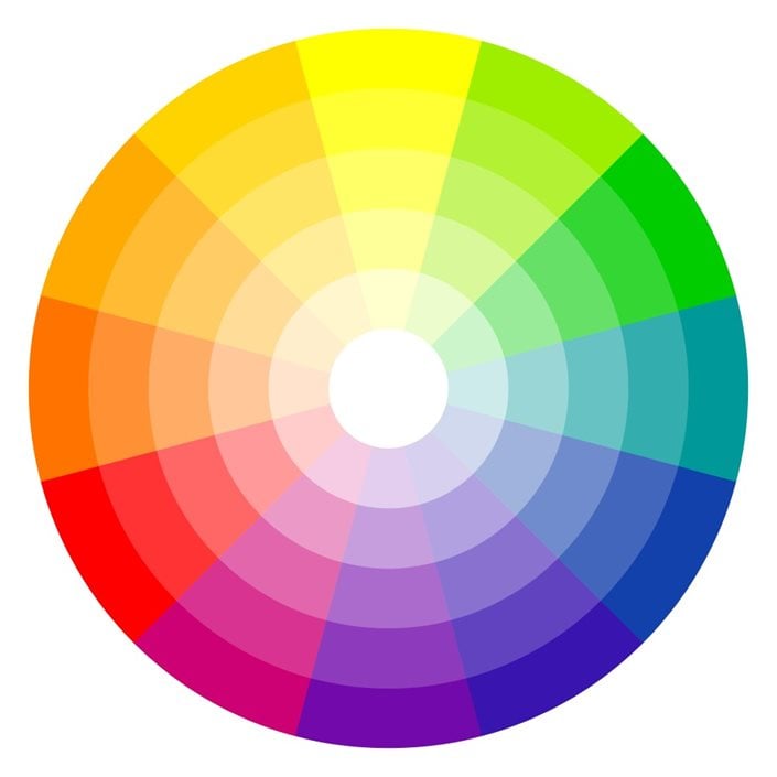
Photo by: picoStudio / Shutterstock.
Primary, Secondary, and Tertiary Colors:
- Primary colors: Red, yellow, and blue.
- Secondary colors: Green, orange, and violet are comprised of an equal mix of primary colors. Blue and yellow make green, red and yellow make orange, and red and blue make violet.
- Tertiary colors: The hues in between are made by combining a primary and secondary color. Tertiary colors include blue-green, orange-red, and blue-purple.
Cool & Warm Colors:
Colors are arranged on the color wheel with warm colors on one side and cool on the other.
- Warm colors of red, orange, and yellow elicit excitement and energy.
- Cool colors of blue, green, and violet evoke a sense of calm and serenity.
Color can be used to create depth in the landscape, with cool colors receding into the background and hot colors coming to the forefront. Utilizing this basic principle can make a small space feel larger.
Neutral Colors:
Neutral colors of white, gray, silver, beige, brown, and black can be used for transition areas between different color schemes, as a starting point for adding other colors, to tone down bolder hues, or as a color scheme all on their own.
In gardening, green is considered a neutral color that serves as a serene backdrop, lending cohesion and calming adjacent colors. “Green, in all its shades and tones, is the nourishing color of nature,” says Johnson. “It calms us with its natural balance of cool and warm undertones.”
Value & Intensity:
Other factors that influence color include value (lightness and darkness) and intensity (saturation). Using lighter hues against darker hues creates contrast. Other colors can be added to a single color to create variations. For example, related colors of violet include purple, lavender, amethyst, magenta, mauve, eggplant, plum, and periwinkle.

